iCatch
Intro
Rooted in the Basics
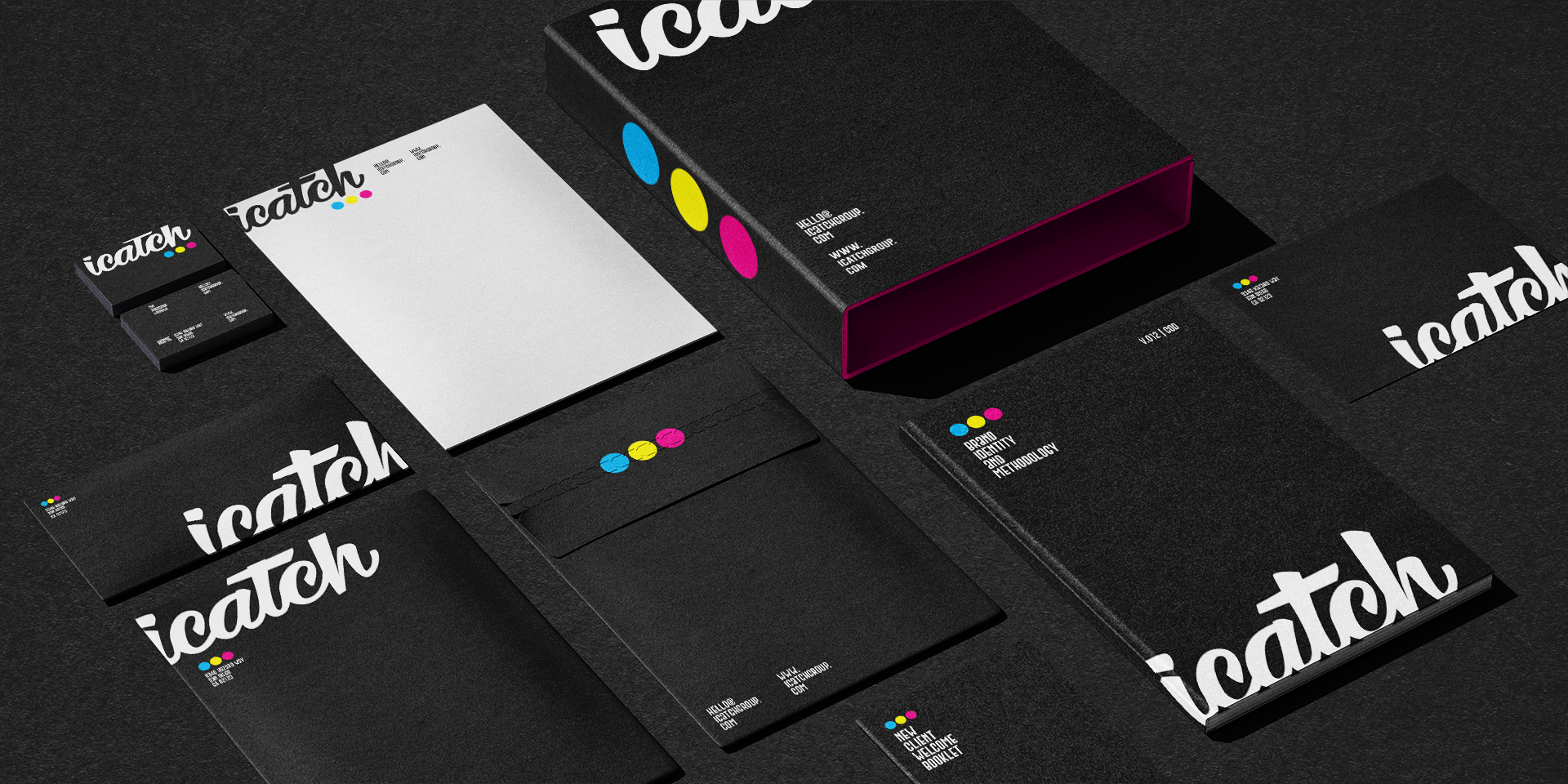
iCatch was a thriving creative agency producing high-volume work for a wide range of clients, but like many fast-moving shops, it had outgrown its own brand. I led the initiative to rethink and redesign the agency’s identity, with the goal of clearly articulating its value proposition and creative philosophy.
We took a simple, intentional approach: building the new visual identity around the four primary colors of CMYK — the core building blocks of all visual ideas. This concept became both a design system and a brand statement, reinforcing the agency’s ability to break down ideas to their core essence, and rebuild them with clarity, creativity, and purpose.
The result was more than a visual update. It was a reintroduction — one that aligned the agency’s look with what was uniquely delivered.
Brand strategy and creative positioning
Visual identity system
Logo redesign and supporting brand marks
Typography, layout, and color standards
Brand voice and messaging framework
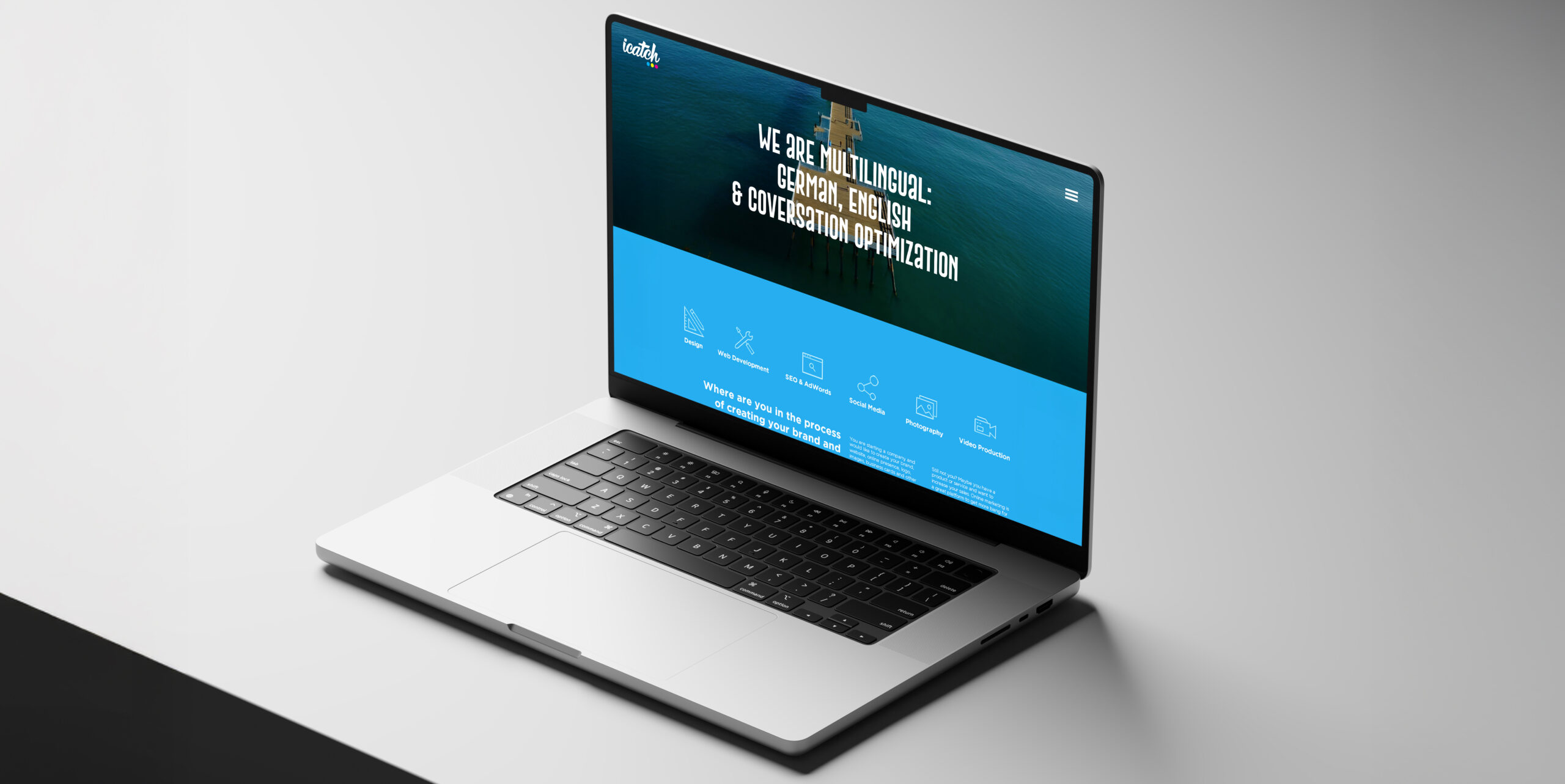
Website refresh and content architecture
Presentation templates
Copy and visuals for marketing collateral
OOH
Social Media Content
iCatch Marketing Agency
Check Out Other Projects
