Fina Flor
Intro
Blooming Style: The Fina Flor Brand Refresh
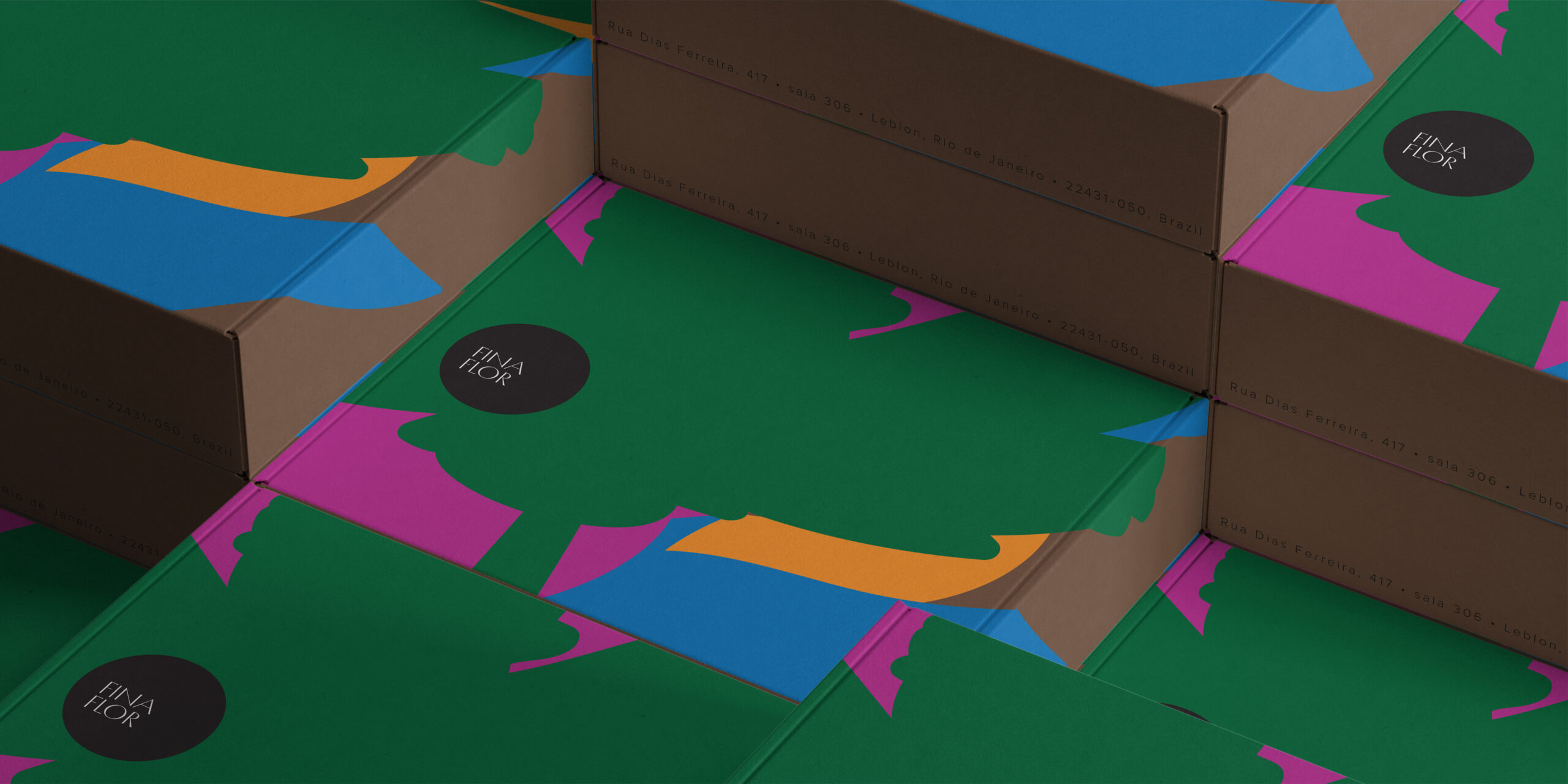
Located in the heart of Rio de Janeiro and inspired by the rich biodiversity of the surrounding Mata Atlântica, Fina Flor is a high-end home design store known for its custom made creations and exceptional craftsmanship. To reflect the brand’s vibrant spirit and the eclectic range of styles it offers, we launched a full-scale brand refresh—reimagining everything from the website and packaging to experiential marketing.
Drawing from the lush, expressive character of the local flora, the new brand identity blooms with energy and elegance. Stylized Mata Atlântica flowers appear throughout the visual language, directly tying to the brand’s name, Flor, meaning “flower” in Portuguese, and reinforcing its Brazilian roots. These flowers also represent the extraordinary diversity of the forest, echoing Fina Flor’s core strength: the ability to deliver a wide variety of styles with creativity and refinement. Every touchpoint, from social media content to refined packaging, was designed to quietly frame their artistry, allowing the brand’s lively personality and design versatility to shine through. The result: a cohesive yet spirited expression that captures Fina Flor’s essence, vivid, refined, and unmistakably Brazilian.
Services
Brand identity system (logo, color palette, typography, icons)
Brand voice and messaging framework
Packaging design
Website design and UX
Social media templates and content strategy
Print collateral (tags, catalogs, in-store signage)
Art direction for product photography
Environmental branding for retail space
Client
Fina Flor


Check Out Other Projects